Premium sports brand identity with bold visual language
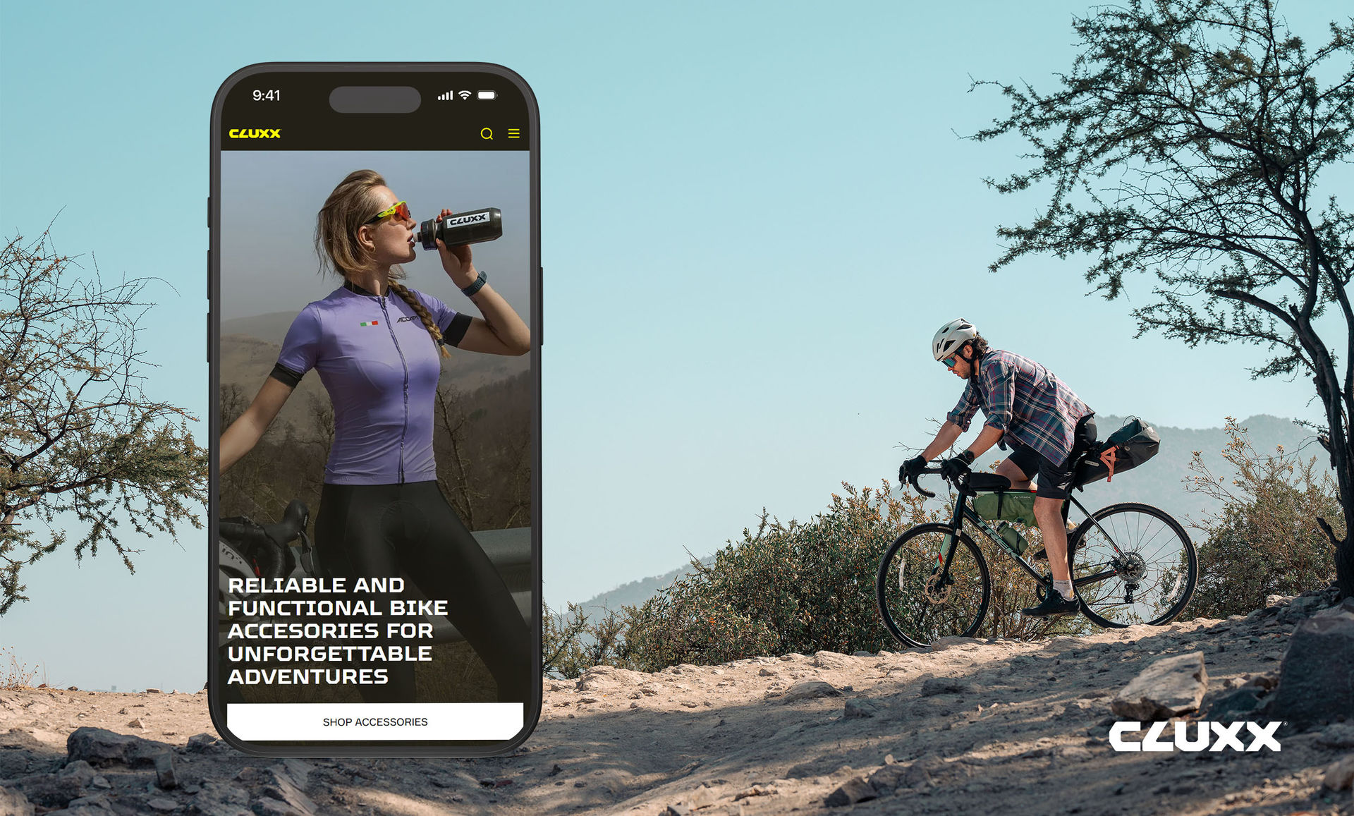
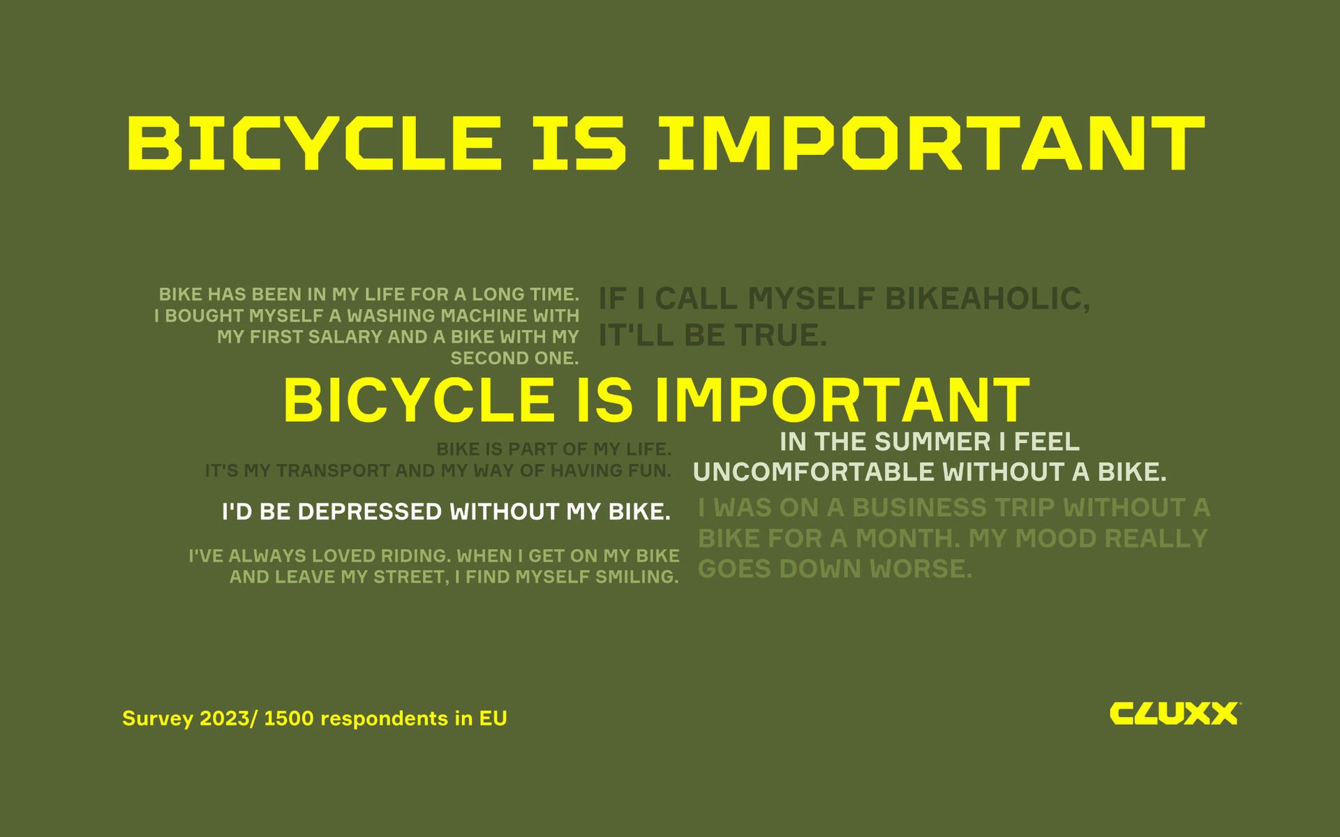
CLUXX is a bicycle accessories brand created for Kant, a sports brand development company. The name CLUXX was inspired by the mechanics of cycling: the latch, the click — "clack, clack." It's short, punchy, and rings well in different languages.
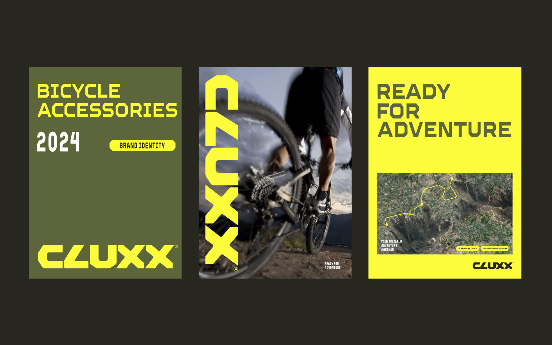
The goal was to create a brand that not only matched international competitors but surpassed them. Category research revealed that bicycle accessories are often sold "off the shelf" without sales consultation — meaning the design had to be extremely attractive and informative at first glance.
A comprehensive competitor analysis uncovered key gaps: competitors' logos were too small and invisible from 1.5 meters away, and color palettes failed to stand out on shelves.
We conducted both quantitative and qualitative research. Based on insights, we defined clear design requirements: a bold logo visible from a distance, and a unique color palette that stands out from competitors while remaining organic and contemporary.
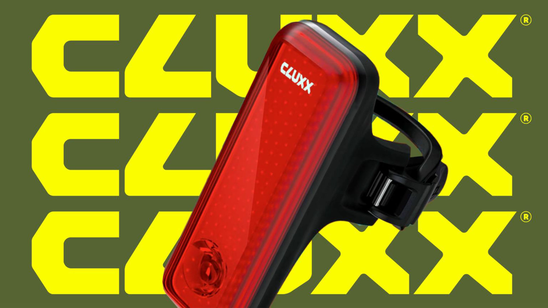
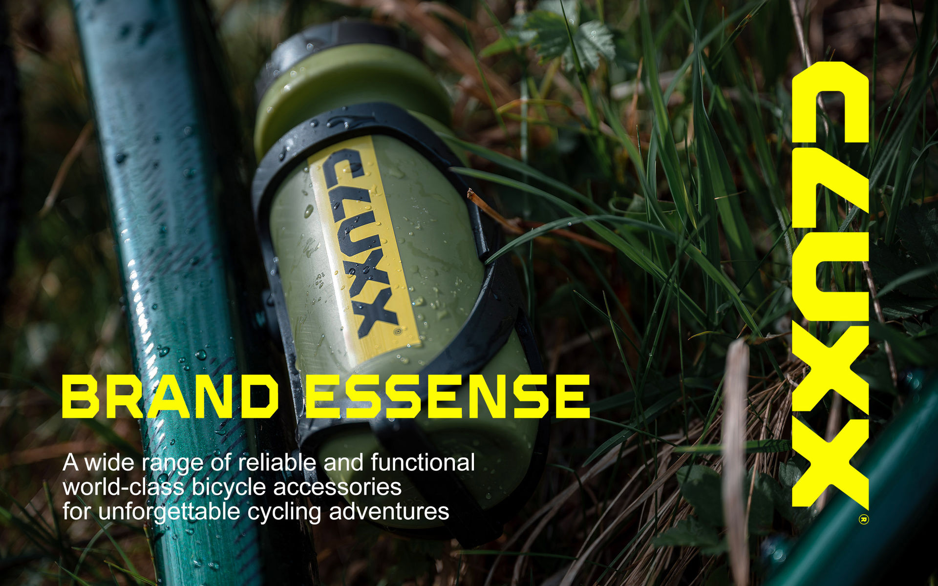
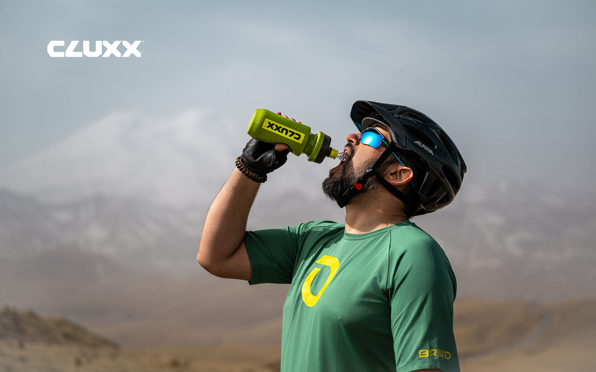
We chose a bright yellow accent color paired with natural swamp green. The logo became large, featuring faceted elements reminiscent of bicycle keys and hex wrenches.
Beyond brand development, we created a product catalog. Analysis of competitors' catalogs showed a lack of quality, informative, and modern solutions. The CLUXX catalog was developed to international standards and received numerous enthusiastic reviews.
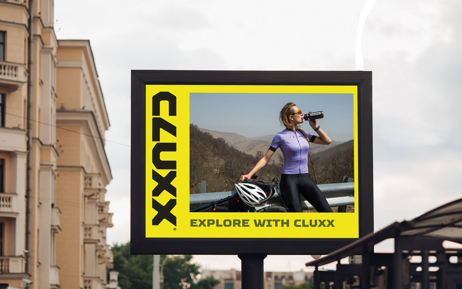
We also developed the brand's website with modern, user-friendly UX/UI.
Within the first year, CLUXX, thanks to its contemporary and functional design, quality assortment, and marketing materials, was warmly received by both wholesale channels and end consumers in Russia and France.
Thank you for reaching out. We've received your message and will get back to you within 24-48 hours.
Important: Check your spam folder just in case, and add hello@open4.dev to your contacts to ensure our response reaches you directly.