Premium brand identity for household care products — reinventing visual language for global market leadership
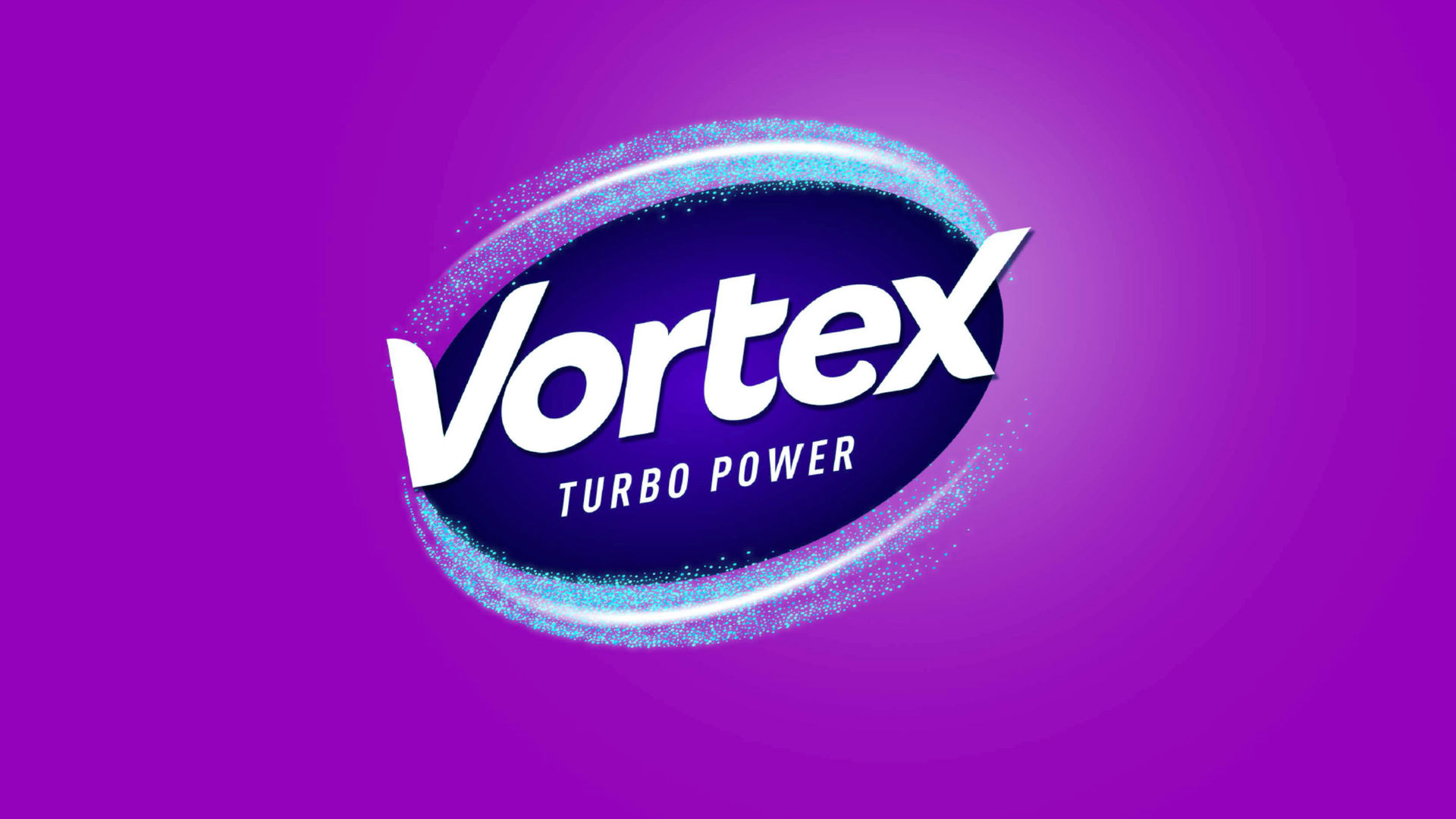
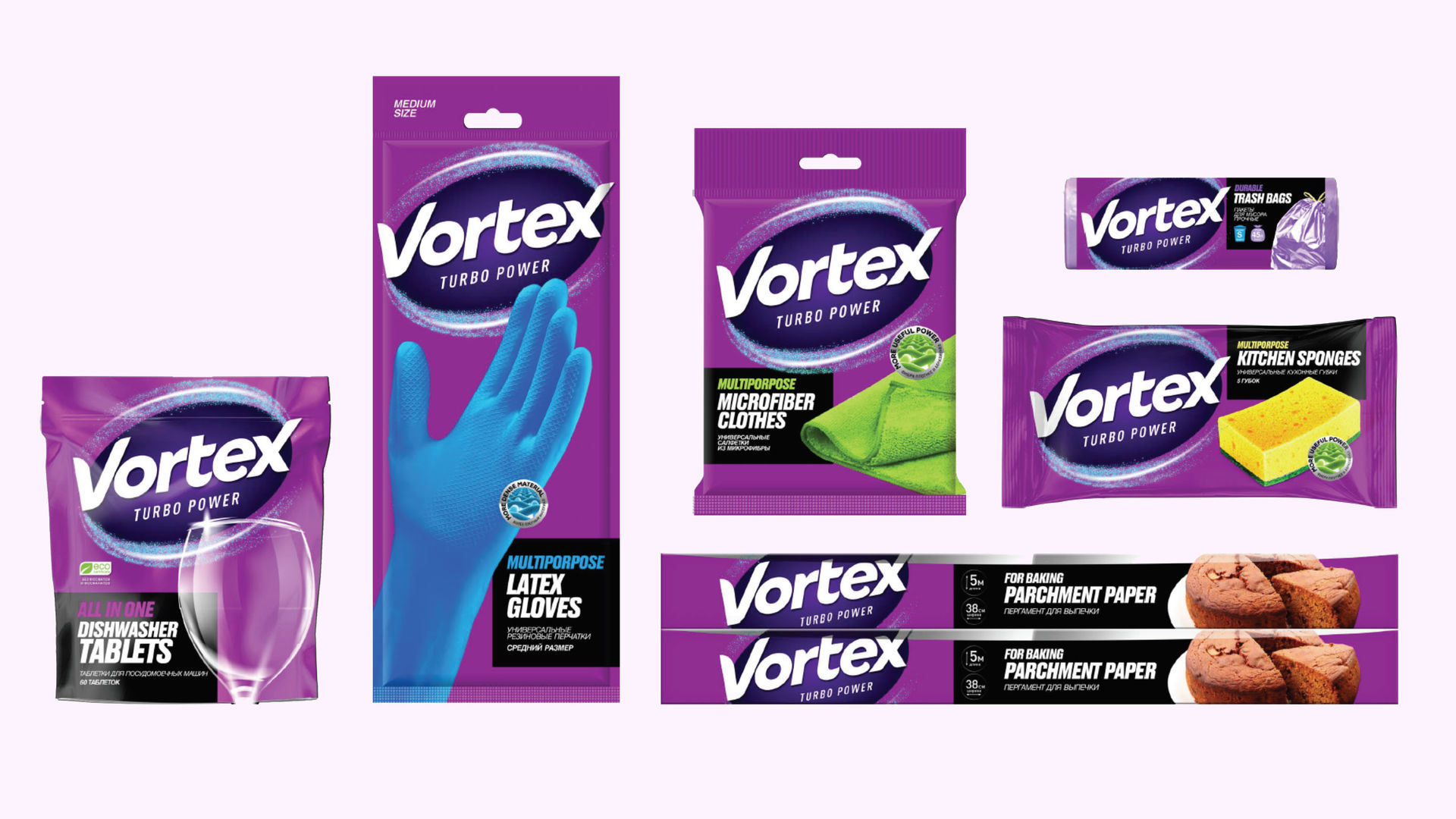
Vortex is a brand of household care products owned by Biosphere Company. The product range includes gloves, sponges, cleaning wipes, dishwasher tablets, and other home care items.
The task was to create a brand identity for the premium segment and support the brand's expansion into European, American, and Middle Eastern markets. The products were of high quality, but the existing design was outdated and prevented the brand from successfully competing with market leaders. A modern visual identity was needed to help Vortex establish itself in new markets and strengthen its position against established competitors.
The task was to conduct a complete rebranding for Vortex. Several key reasons drove this decision:
1. Outdated design — The existing visual identity was clearly outdated and no longer reflected the quality of the products.
2. Premium segment positioning — The brand planned to enter and establish itself in the premium household care segment, successfully competing with market leaders thanks to high product quality. However, the old design was holding back these ambitions.
3. Global market expansion — Vortex had plans to expand into European, American, and Middle Eastern markets (Dubai). The existing design was simply too archaic for international ambitions.
The product quality was already at a world-class level — what the brand needed was a visual identity that would help it compete effectively and support its entry into new markets.
Visual Identity Reinvention: The work on the brand included a complete reinvention of the visual identity. The name Vortex was preserved, but the entire design was developed from scratch. Part of the colors was retained, but the overall visual concept became fundamentally new.
Premium Positioning Strategy: Premium positioning requires corresponding visual presentation. Product quality alone does not translate into premium perception — the design must do that heavy lifting.
Product Line Expansion: New product lines were created, including dishwasher tablets. This product was developed according to world quality standards and visually represented a product of international caliber.
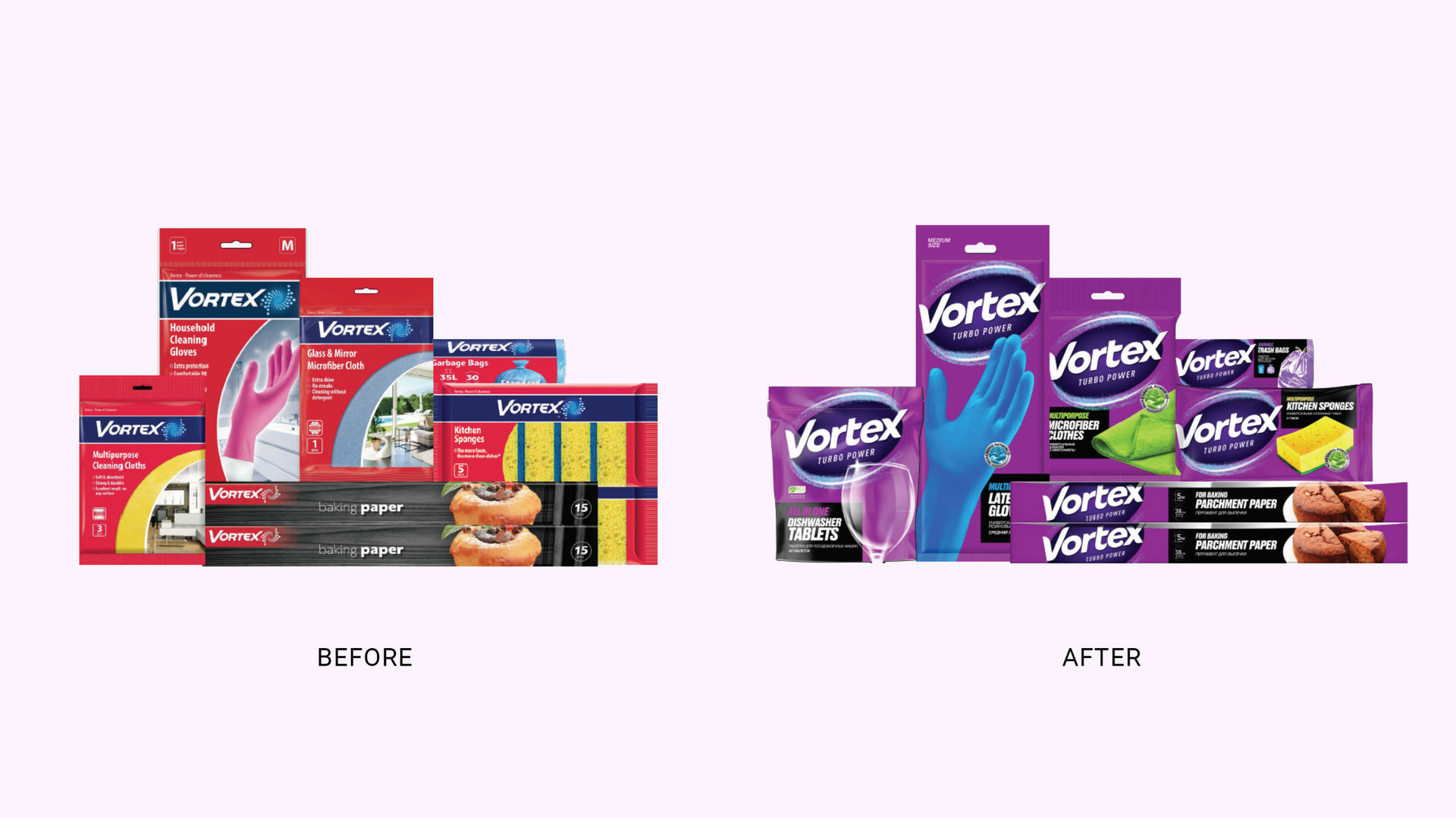
Vortex successfully entered the premium household care segment with a completely new visual identity that communicates quality and sophistication.
What was delivered: Complete brand identity reinvention including visual identity system, premium packaging design, brand strategy, and product presentation standards. The brand maintains recognition from the past while signaling a bold new premium positioning.
Results: The brand's products are now sold in more than 5 countries worldwide, including the USA, United Kingdom, Dubai, Italy, Spain, Portugal, and other countries — a testament to the successful premium repositioning strategy.
Thank you for reaching out. We've received your message and will get back to you within 24-48 hours.
Important: Check your spam folder just in case, and add hello@open4.dev to your contacts to ensure our response reaches you directly.