Complete rebranding of a cycling brand from regional player to European contender
WELT had loyal customers — wholesale companies, retail chains, and end consumers who knew the brand. But the level of brand presence was clearly insufficient for international competition. The task was to transform WELT from a regional trade mark into a full-fledged European brand.
WELT had loyal customers — wholesale companies, retail chains, and end consumers who knew the brand. But there was no brand at a level sufficient for international competition. The bikes themselves were cluttered with chaotic sticker designs. Marketing materials — site, catalogs, banners, even shipping boxes — all looked outdated and inconsistent.
The ambition was clear: to become an international brand on par with market leaders like Cube, Focus, and Merida — in both quality and brand perception. The challenge: create a brand from scratch without losing existing customers. Preserve continuity while making WELT visible, modern, minimal, and distinctly European.
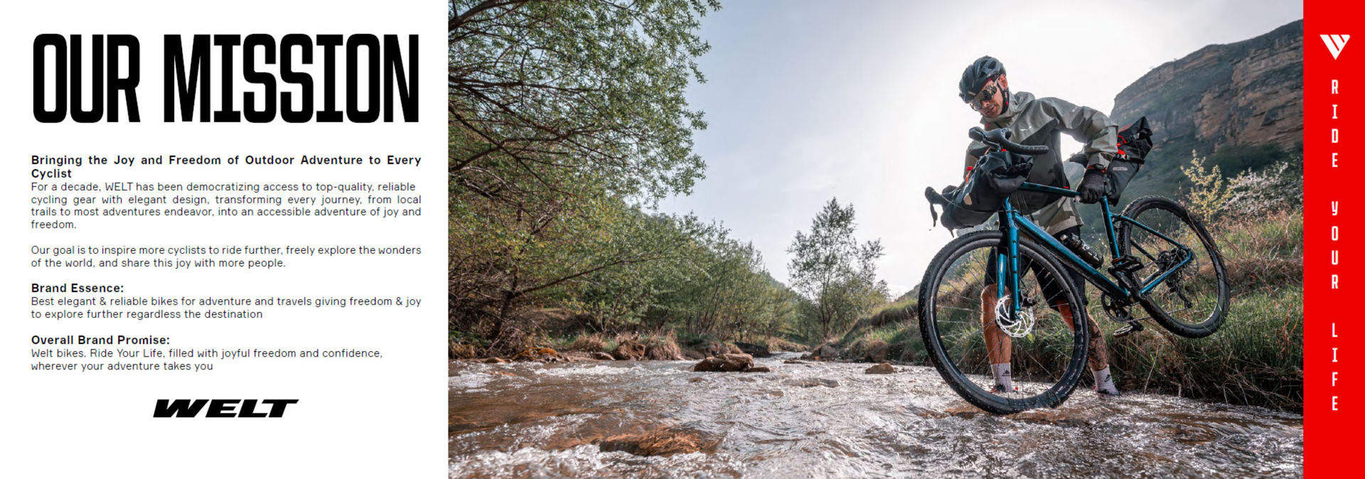
Research & Positioning: Quantitative and qualitative research revealed the key insight: for cyclists, a bike is not just sports equipment — it's a tool for adventure, freedom, and discovering the world. Even a city bike can be an exploration. This insight became the foundation of everything.
Competitive Analysis: Competitors like Cube, Focus, and Merida dominated the segment. WELT matched them in component quality — transmission, forks, frame, wheels, brakes — but needed to match them in visual appeal. The unique advantage: perfectly polished weld seams on the frame, something competitors lacked.
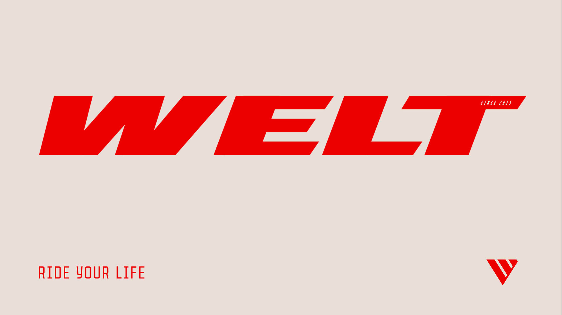
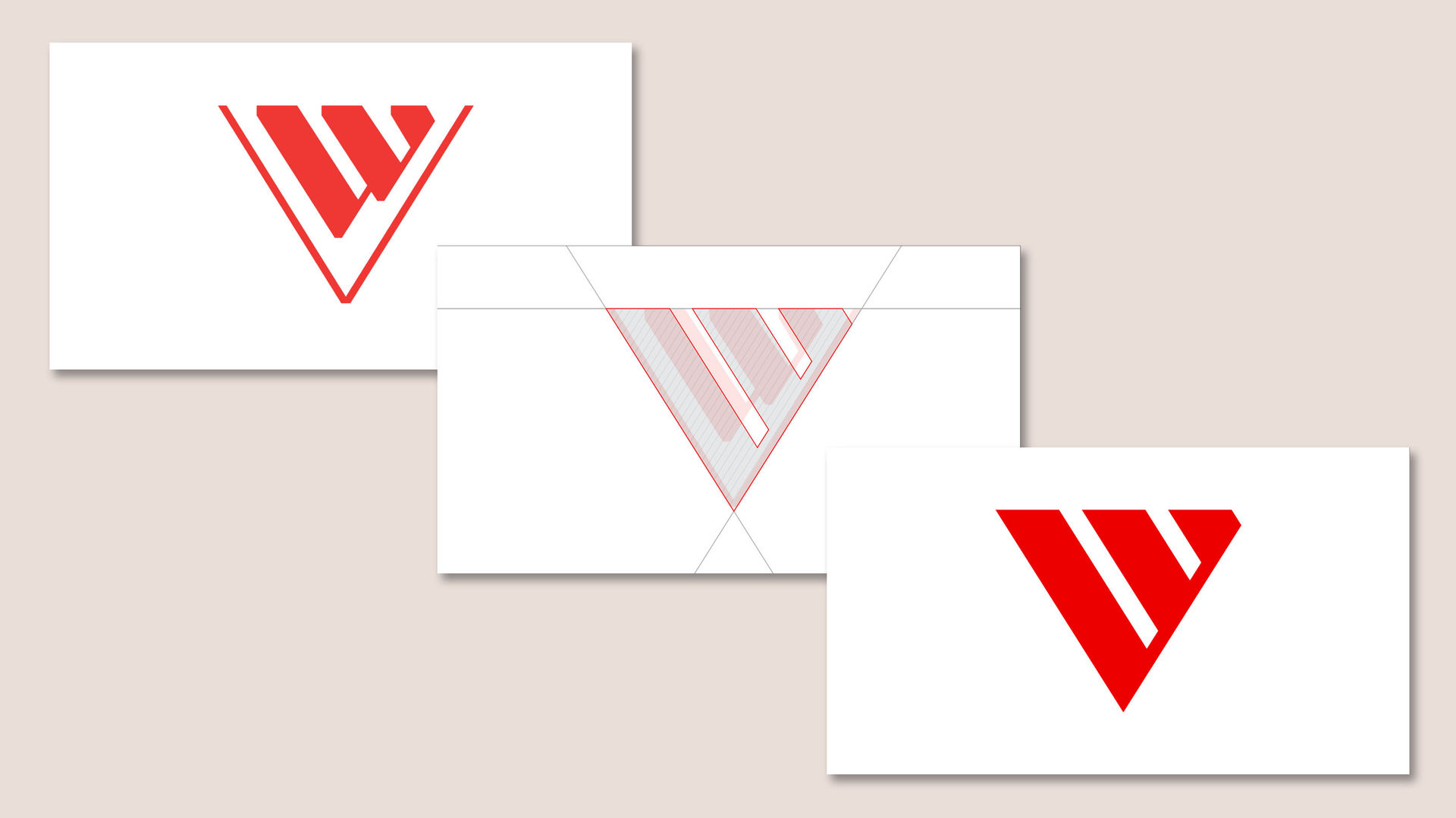
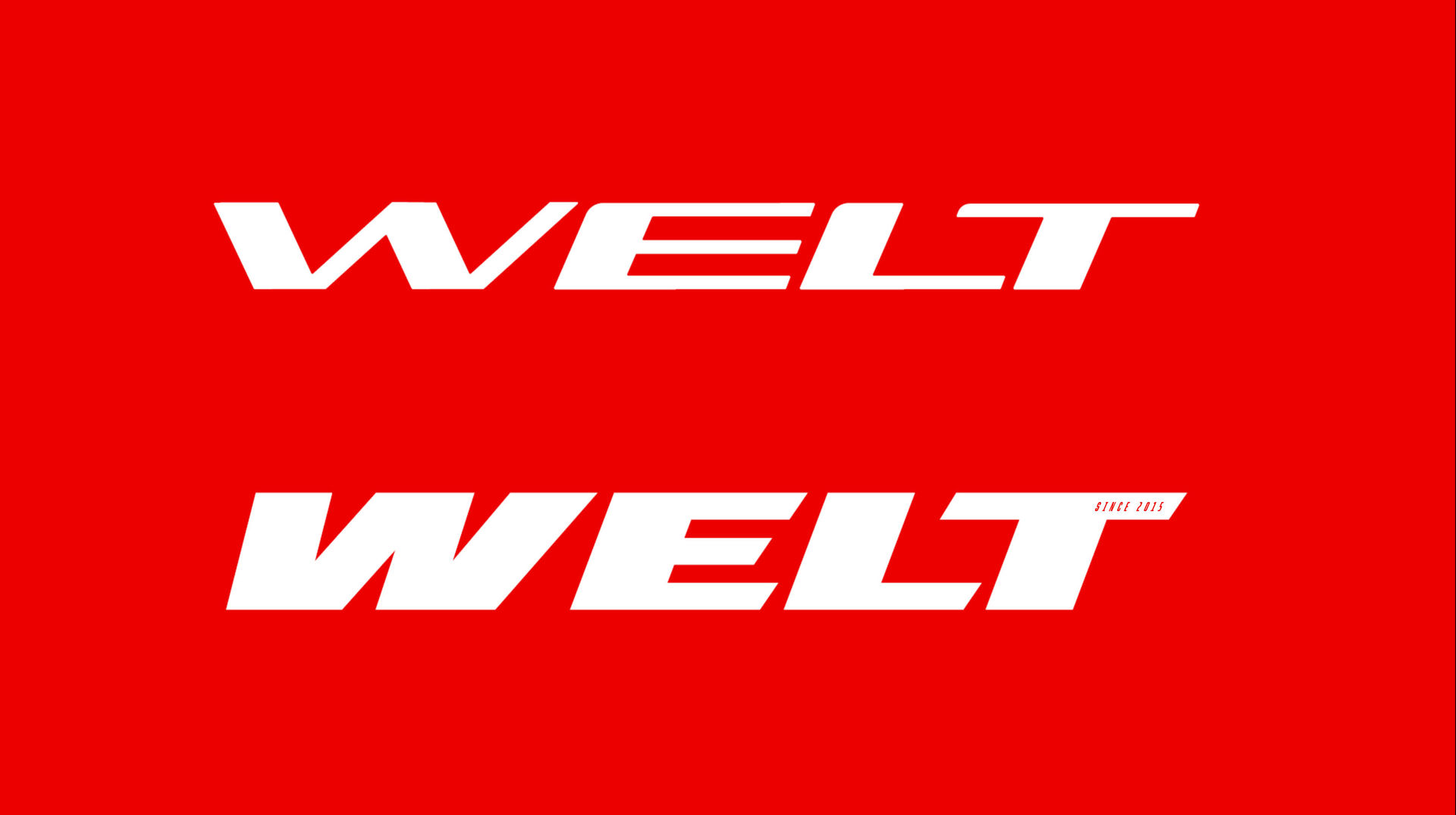
Logo Evolution: The existing logo had to stay recognizable to loyal customers. The task was to refresh it completely while maintaining continuity. New colors were kept close to original. The result: a fully updated yet familiar mark.
Slogan Strategy: Different markets needed different voices. Russia: more rational, price-conscious. Europe: emotional, values-driven.
Russia: "Think. Feel. Ride."
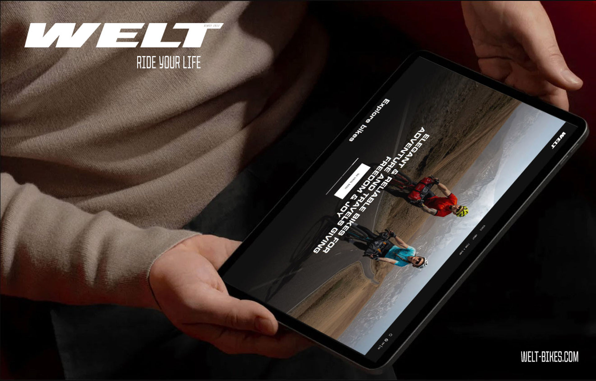
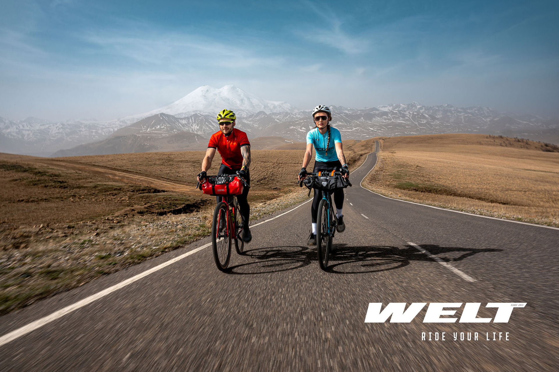
Europe: "Ride your Life"
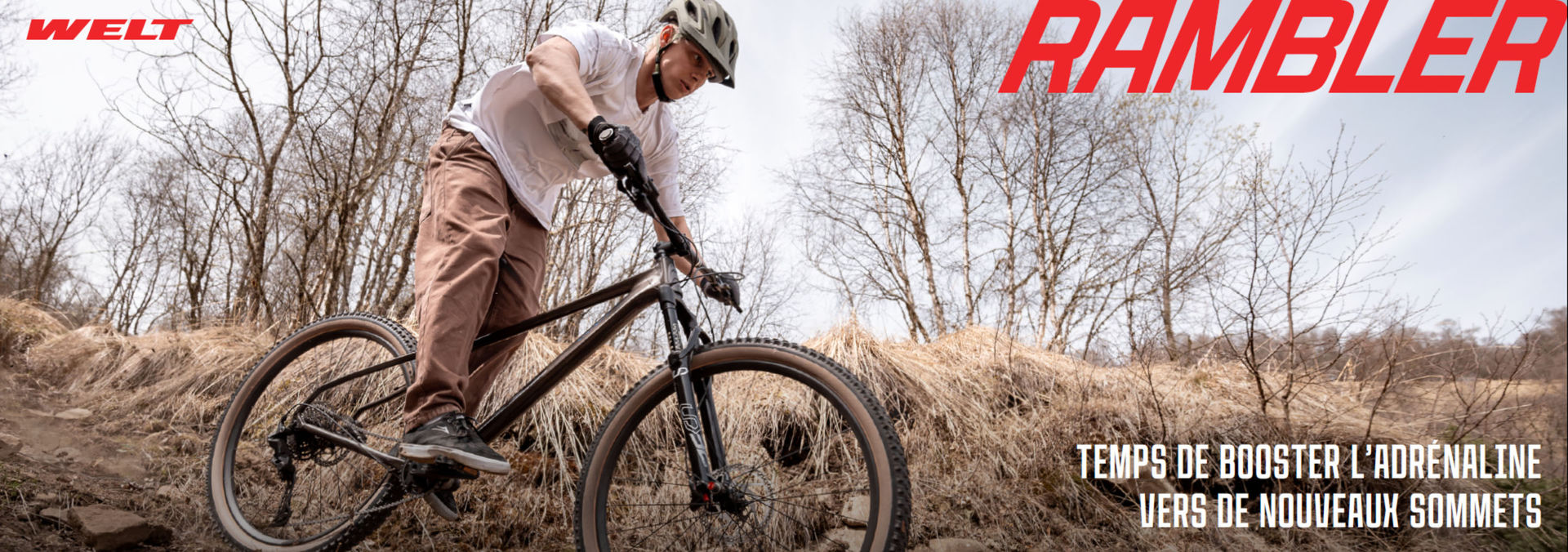
Visual Identity: Gravel bikes became the hero across all communications. Photography, articles, website — everywhere the focus was on travel and adventure. The entire brand book was built around this positioning.
The rebranding transformed WELT from a trade mark into a complete European brand. Every touchpoint was updated: site, catalogs, banners, packaging, and the bikes themselves.
What was delivered: Complete visual identity system, brand book with communication guidelines, photography and visual language, slogans for different markets, and a modern multilingual website with e-commerce.
Results: On a stagnant market, WELT achieved 15% growth in Russia. In Europe, sales nearly tripled — remarkable for a newcomer competing against brands with decades of market presence. The brand now has the visual consistency and emotional resonance to support continued international expansion.
Thank you for reaching out. We've received your message and will get back to you within 24-48 hours.
Important: Check your spam folder just in case, and add hello@open4.dev to your contacts to ensure our response reaches you directly.